Tips
All Variables in RED
This Page
Tips Some used on this website
All Variables in RED
Click Here
JavaScript - Go To:-
Compare Two Images
Zoom Images
Sound On Mouse Over
Full-Screen
Pop-Up Window
Full-Screen Pop-Up
Mouse Over
Mouse Over Buttons
Welcome
Days To Go
Disable Select
Copyright Image
Disable Right Click
Snow
Marquees
Day and Night Photos
HTML Analogue Clock
Scroll to Top of Page
Drop Down Links
Popup Boxes
Random Images
You can download a "Zipped" file with the STYLE.CSS file Click Here (3kb)
1. To set the page Colour and and Background
body {
background-color: #EFEFEF ;
background-image: url("images/bg.jpg ");
P { color: Black;
font-size: medium ;
font-family: "Times New Roman ", serif ;
text-align: justify DT { color: Black;
font-size: medium ;
font-family: "Times New Roman ", serif ;
text-align: justify
3. To override the default text format, eg: (in the HTML file) <P class="left"
P.right { color: Black;
font-size: medium ;
font-family: "Times New Roman ", serif ;
text-align: right
P.left { color: Black;
font-size: medium ;
font-family: "Times New Roman ", serif ;
text-align: left
DT.left { color: Black;
font-size: medium ;
font-family: "Times New Roman ", serif ;
text-align: left
DT.right { color: Black;
font-size: medium ;
font-family: "Times New Roman ", serif ;
text-align: right
Photos with Mouse Over
.big {
position: relative ;
opacity: 1 ;
transform: scale(1 , 1 );
transition: 0.3s ease;
.big:hover {
transform: scale(1.1 , 1.1 );
opacity: 1 ;
z-index: 1 ;
Adding a BIG Effect (with Mouse Over) class="big"
Move Mouse Over
.small {
position: relative ;
opacity: 1 ;
transform: scale(1 , 1 );
transition: 0.3s ease;
.small:hover {
transform: scale(0.9 , 0.9 );
opacity: 1 ;
z-index: 1 ;
Adding a SMALL Effect (with Mouse Over) class="small"
Move Mouse Over
.dim {
opacity: 1.0 ;
filter: alpha(opacity=100 );
transition: 0.3s ease;
.dim:hover {
opacity: 0.6 ;
filter: alpha(opacity=60 );
Adding a DIM Effect (with Mouse Over) class="dim"
Move Mouse Over
.rotate {
position: relative ;
opacity: 1 ;
transition: 0.3s ease;
.rotate:hover {
transform: rotate(-15 deg);
opacity: 1 ;
z-index: 1 ;
Adding a ROTATE Effect (with Mouse Over) class="rotate"
Move Mouse Over
.spin {
position: relative ;
opacity: 1 ;
transition: 0.3s ease;
.spin:hover {
transform: rotate(360 deg);
opacity: 1 ;
z-index: 1 ;
Adding a SPIN Effect (with Mouse Over) class="spin"
Move Mouse Over
.bw {
position: relative ;
opacity: 1 ;
transition: 0.3s ease;
.bw:hover {
-webkit-filter: grayscale(100 %);
filter: grayscale(100 %);
Adding a BLACK & WHITE Effect (with Mouse Over) class="bw"
Move Mouse Over
.shake {
.shake:hover {
animation: shake 0.5s;
animation-iteration-count: infinite;
}
@keyframes shake {
0% { transform: translate(1px, 1px) rotate(0deg); }
10% { transform: translate(-1px, -2px) rotate(-1deg); }
20% { transform: translate(-3px, 0px) rotate(1deg); }
30% { transform: translate(3px, 2px) rotate(0deg); }
40% { transform: translate(1px, -1px) rotate(1deg); }
50% { transform: translate(-1px, 2px) rotate(-1deg); }
60% { transform: translate(-3px, 1px) rotate(0deg); }
70% { transform: translate(3px, 1px) rotate(-1deg); }
80% { transform: translate(-1px, -1px) rotate(1deg); }
90% { transform: translate(1px, 2px) rotate(0deg); }
100% { transform: translate(1px, -2px) rotate(-1deg); }
}
}
Shake a Photo (with Mouse Over) class="shake"
Move Mouse Over
Photos with Radius
.frame {
border: 1px solid #000000 ;
border-radius: 20px ;
padding: 3px ;
Adding a Frame to Your Photos class="frame"
.imgbr {
border: 2px solid transparent ;
padding: 2px ;
border-radius: 25px ;
Adding a Radius (No border) class="imgbr"
.imgbr2 {
border: 1px solid black ;
padding: 0px ;
border-radius: 15px ;
Adding a Radius (with border) class="imgbr2"
.imgbr3 {
border: 0px solid transparent ;
padding: 0px ;
border-radius: 8px ;
Adding a Small Radius (No border) class="imgbr3"
.imgbrc2 {
border: 2px solid black ;
padding: 0px ;
border-radius: 100% ;
Adding a Full Radius (with border) class="imgbrc2" Note: If the photo is square it will be a circle
.imgbrc1 {
border: 0px solid transparent ;
padding: 0px ;
border-radius: 100% ;
Adding a Full Radius (No border) class="imgbrc1" Note: If the photo is square it will be a circle
.imgbrc3 {
border: 2px solid black ;
padding: 5px ;
border-radius: 100% ;
Adding a Full Radius (with border and padding) class="imgbrc3" Note: If the photo is square it will be a circle
Photos with Radius and Mouse Over
.imgbr4 {
border: 1px solid black ;
padding: 0px ;
border-radius: 8px ;
.imgbr4:hover {
opacity: 0.6 ;
filter: alpha(opacity=60 );
Adding Radius & DIM Effect (with border and Mouse Over) class="imgbr4"
Move Mouse Over
.imgbr5 {
border: 1px solid black ;
padding: 0px ;
border-radius: 8px ;
transition: 0.3s ease;
.imgbr5:hover {
transform: scale(1.1, 1.1 );
opacity: 1 ;
z-index: 1 ;
Adding Radius & BIG Effect (with border and Mouse Over) class="imgbr5"
Move Mouse Over
.imgbr5a {
border: 1px solid black ;
padding: 0px ;
border-radius: 8px ;
transition: 0.3s ease;
.imgbr5a:hover {
transform: scale(0.9, 0.9 );
opacity: 1 ;
z-index: 1 ;
Adding Radius & SMALL Effect (with border and Mouse Over) class="imgbr5a"
Move Mouse Over
.imgbr6 {
border: 1px solid black ;
padding: 0px ;
border-radius: 8px ;
transition: 0.3s ease;
.imgbr6:hover {
transform: rotate(15 deg);
opacity: 1 ;
z-index: 1 ;
Adding Radius & ROTATE Effect (with border and Mouse Over) class="imgbr6"
Move Mouse Over
.imgbr7 {
border: 1px solid black ;
padding: 0px ;
border-radius: 8px ;
transition: 0.3s ease;
.imgbr7:hover {
transform: rotate(360 deg);
opacity: 1 ;
z-index: 1 ;
Adding Radius & SPIN Effect (with border and Mouse Over) class="imgbr7"
Move Mouse Over
.imgbr8 {
border: 1px solid black ;
padding: 0px ;
border-radius: 8px ;
transition: 0.3s ease;
.imgbr8:hover {
-webkit-filter: grayscale(100 %);
filter: grayscale(100 %);
Radius & BLACK & WHITE Effect (with border and Mouse Over) class="imgbr8"
Move Mouse Over
.imgbr9 {
border: 1px solid black ;
padding: 0px ;
border-radius: 8px ;
transition: 0.3s ease;
}
.shake:hover {
animation: shake 0.5s;
animation-iteration-count: infinite;
}
@keyframes shake {
0% { transform: translate(1px, 1px) rotate(0deg); }
10% { transform: translate(-1px, -2px) rotate(-1deg); }
20% { transform: translate(-3px, 0px) rotate(1deg); }
30% { transform: translate(3px, 2px) rotate(0deg); }
40% { transform: translate(1px, -1px) rotate(1deg); }
50% { transform: translate(-1px, 2px) rotate(-1deg); }
60% { transform: translate(-3px, 1px) rotate(0deg); }
70% { transform: translate(3px, 1px) rotate(-1deg); }
80% { transform: translate(-1px, -1px) rotate(1deg); }
90% { transform: translate(1px, 2px) rotate(0deg); }
100% { transform: translate(1px, -2px) rotate(-1deg); }
}
}
Radius & Shake a Photo (with Mouse Over) class="imgbr9"
Move Mouse Over
.gallery {
display: inline-block;
border: 1px solid #0B610B ;
border-radius: 4px ;
padding: 5px ;
transition: 0.3s ;
opacity: 1 ;
filter: alpha(opacity=100 );
.gallery:hover {
box-shadow: 0 0 2px 3px rgba(256, 0, 0, 1) ;
opacity: 0.5 ;
filter: alpha(opacity=50) ;
Gallery Thumbnails (with Mouse Over) class="gallery"
Move Mouse Over
Pop-in Photos
.imgbrbigleft {
border: 1 px solid Black ;
padding: -1 px;
border-radius: transition: 0.1 s ease;
}
.imgbrbigleft:hover {
position: relative;
top: 5 px;
transform: scale(1.1 , 1.1 );
opacity: 1;
z-index: 1;
}
.imgbrbigleft:active {
position: relative;
top: 300 px;
transform: scale(8 , 8 );
opacity: 1;
z-index: 1;
}
Pop-in Photos from Right of Page (with Mouse Over) class="imgbrbigleft"
Move Mouse Over and Click
.imgbrbigright {
border: 1 px solid Black ;
padding: -1 px;
border-radius: transition: 0.1 s ease;
}
.imgbrbigright:hover {
position: relative;
left: -5 px;
transform: scale(1.1 , 1.1 );
opacity: 1;
z-index: 1;
}
.imgbrbigright:active {
position: relative;
left: -300 px;
transform: scale(8 , 8 );
opacity: 1;
z-index: 1;
}
Pop-in Photos from Left of Page (with Mouse Over) class="imgbrbigright"
Move Mouse Over and Click
Adding Margin to Photos
.imgl
{margin-right: 2 %;
.imgr
{margin-left: 2 %;
Adding a Margin to the Right or Left class="imgl" Text Goes Here Text Goes Here Text Goes Here Text Goes Here Text Goes Here Text Goes Here
<IMG class="imgr"
Text Goes Here Text Goes Here Text Goes Here Text Goes Here Text Goes Here Text Goes Here
Mini Slideshow
.fling-minislide {
width: 250 px;
height: 166 px;
position:relative;}
.fling-minislide img{ position:absolute;
animation:fling-minislide 20s infinite;
overflow: hidden;
opacity: 0;
width: 100%;
height: auto;
border: 2 px solid black;
padding: 0px;
border-radius: 15 px;}
@keyframes fling-minislide {25%{opacity:1;} 40%{opacity:0;}}
.fling-minislide img:nth-child(4){animation-delay:0s;}
.fling-minislide img:nth-child(3){animation-delay:5s;}
.fling-minislide img:nth-child(2){animation-delay:10s;}
.fling-minislide img:nth-child(1){animation-delay:15s;}
Adding a Mini Slideshow Effect In the HTML file <CENTER><TABLE BORDER="0" CELLPADDING="3" CELLSPACING="3">
<TR><TD>
<div class="fling-minislide">
<img src="xxx .jpg">
<img src="xxx .jpg">
<img src="xxx .jpg">
<img src="xxx .jpg">
</div>
</TD></TR>
</TABLE></CENTER>
Bullet
.bullet{
background-color:#000000 ;
color:#FFFFFF ;
font:bold 12 px arial;
display:inline-block;
padding-left:6 px;
padding-right:6 px;
border-radius:50 %;
text-align:center}
.bullet:hover {
background-color:#FFFFFF ;
color:#000000 ;}
Adding a BULLET Effect (with Mouse Over)
<span class="bullet">1 </span> xxxxxxxx
1 Bullet12 Bullet23 Bullet34 Bullet35 Bullet36 Bullet4
Zoom
.zoom {
animation:animatezoom 0.9 s}
@keyframes animatezoom{from{transform:scale(0)} to{transform:scale(1)}
}
<BODY class="zoon">
Scroll
.scroll {
overflow: hidden;
white-space: nowrap;
margin: 0 auto;
animation:
typing 3.5s steps(40, end),
blink-caret .75s step-end infinite;
}
@keyframes typing {
from { width: 0 }
to { width: 100% }
}
<div class="scroll">Test/Images </div>Or just for one line:- <P class="scroll">Test/Images </P> <DT class="scroll">Test/Images </DT>
Links
.link:link {color:#0000ff ;text-decoration: none ;}29088A ;text-decoration: none ;}ff0000 ;text-decoration: underline ;}ff0000 ;text-decoration: none ;}In the HTML file class="link" HREF="xxxx .html"><B>New Link </B></A>Or with the CSS file downloaded
New Link
Visited Link
Buttons
In the HTML file class="button" HREF="xxxx .html">Button </A>class="button1" HREF="xxxx .html">Button1 </A>class="button2" HREF="xxxx .html">Button2 </A>class="button3" HREF="xxxx .html">Button3 </A>class="button4" HREF="xxxx .html">Button4 </A>With the CSS file downloaded
Button
Button1
Button2
Button3
Button4
Buttons
.dropbtn {
background-color: # 008000 ;
position: relative;
color: white ;
padding: 2 px;
font:bold 12 px arial;
border: none;
padding-left: 5 px;
padding-right: 5 px;
border-radius: 8 px;
}
.dropdown {
position: relative;
display: inline-block;
}
.dropdown-content {
display: none;
position: absolute;
background-color: # ffffff ;
min-width: 150 px;
z-index: 1;
}
.dropdown-content a {
color: black;
text-decoration: none;
display: block;
}
.dropdown-content a:hover {background-color: # dddddd ;}
.dropdown:hover .dropdown-content {display: block;}
.dropdown:hover .dropbtn {background-color: # 4CAF50 ;}
Or with the CSS file downloaded
In the HTML file <div class="dropdown">
<button class="dropbtn">Go To </button>
<div class="dropdown-content">
<a href="xxxx.xxx "> Link 1 </a>
<a href="xxxx.xxx "> Link 2 </a>
<a href="xxxx.xxx "> Link 3 </a>
<a href="xxxx.xxx "> Link 4 </a>
<a href="xxxx.xxx "> Link 5 </a>
And so on
</div>
</div>
Text Over Image (On Mouse Over)
.textover1 {
position: relative;
width: 100%;
}
.middle1 {
transition: .5s ease;
opacity: 0;
position: absolute;
top: 50%;
left: 50%;
transform: translate(-50%, -50%);
-ms-transform: translate(-50%, -50%);
text-align: center;
z-index: 1;
}
.textover1:hover .middle1 {
opacity: 1;
}
.text1 {
background-color: # 000000 ;
color: white;
border: 2 px solid white;
padding-right: 2 px;
border-radius: 8 px;
font: bold 12 px arial;
padding: 2 px 10 px;
In the HTML file <div class="textover1">
<img src=" xxxx.xxx " ALT=" xxxxx " TITLE=" xxxxx " WIDTH=" 250 " HEIGHT=" 166 " BORDER=" 1 ">
<div class="middle1">
<div class="text1"> xxxxx </div>
</div>
</div>
Move Mouse Over
Or with the CSS file downloaded
Text Over Image (On Mouse Over)
.textover2 {
position: relative;
width: 100%;
}
.middle2 {
transition: .5s ease;
opacity: 0;
position: absolute;
top: 50%;
left: 50%;
transform: translate(-50%, -50%);
-ms-transform: translate(-50%, -50%);
text-align: center;
z-index: 1;
}
.textover2:hover .middle2 {
opacity: 1;
}
.text2 {
background-color: # ffffff ;
color: black;
border: 2 px solid black;
padding-right: 2 px;
border-radius: 8 px;
font: bold 12 px arial;
padding: 2 px 10 px;
}
In the HTML file <div class="textover2">
<img src=" xxxx.xxx " ALT=" xxxxx " TITLE=" xxxxx " WIDTH=" 250 " HEIGHT=" 166 " BORDER=" 1 ">
<div class="middle2">
<div class="text2"> xxxxx </div>
</div>
</div>
Move Mouse Over
Or with the CSS file downloaded
Text Over Image (On Mouse Over)
.textover3 {
position: relative;
width: 100%;
}
.middle3 {
transition: .5s ease;
opacity: 0;
position: absolute;
top: 50%;
left: 50%;
transform: translate(-50%, -50%);
-ms-transform: translate(-50%, -50%);
text-align: center;
z-index: 1;
}
.textover3:hover .middle3 {
opacity: 1;
}
.text3 {
background-color: solid transparent;
color: white ;
border: solid transparent;
padding-right: 2 px;
border-radius: 8 px;
font: bold 14 px arial;
padding: 2 px 10 px;
}
In the HTML file <div class="textover3">
<img src=" xxxx.xxx " ALT=" xxxxx " TITLE=" xxxxx " WIDTH=" 250 " HEIGHT=" 166 " BORDER=" 1 ">
<div class="middle3">
<div class="text3"> xxxxx </div>
</div>
</div>
Move Mouse Over
Or with the CSS file downloaded
Text Over Image
.textover4 {
position: relative;
text-align: center;
color: Black ;
}
.centered4 {
position: absolute;
font: bold 12 px arial;
bottom: 1 px;
left: 50%;
transform: translate(-50%, -50%);
}
In the HTML file <div class="textover4">
<img src=" xxxx.xxx " ALT=" xxxxx " TITLE=" xxxxx " WIDTH=" 250 " HEIGHT=" 166 " BORDER=" 1 ">
<div class="centered4"> xxxxx </div>
</div>
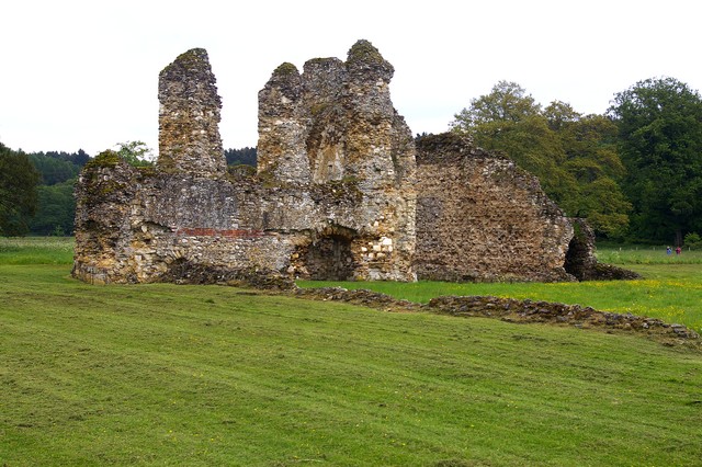
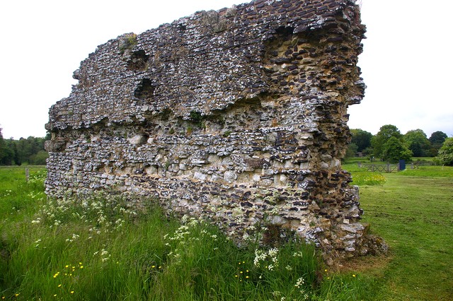
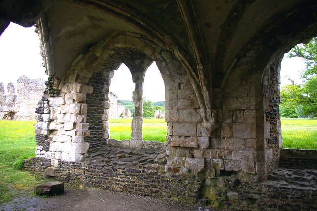
Waverley Abbey, Surrey
Or with the CSS file downloaded
Image Over Image
#containerg {
position:relative;
}
#img2 {
position: absolute;
left: 69 px;
top: 25 px;
}
This Over This
In the HTML file <div id="containerg">
<img src=" xxxx.xxx " id="img1" WIDTH="150" HEIGHT="200" BORDER="0" />
<img src=" xxxx.xxx " id="img2" WIDTH="150" HEIGHT="150" BORDER="0" />
</div>
Or with the CSS file downloaded
You can download a "Zipped" file with the STYLE.CSS file Click Here (3kb)
JavaScript Tips
These website files are given here "as is"
basis. A.J.H. Computer Services makes no representations or warranties
of any kind, express or implied, as to the operation of the sites. The
information, content, materials or products, included with these files.
To the full extent permissible by applicable law, A.J.H. Computer Services
disclaims all warranties, express or implied, including but not limited
to, implied warranties of merchantability and fitness for a particular
purpose. A.J.H. Computer Services will not be liable for any damages
of any kind arising from the use of these files, including but not limited
to direct, indirect, incidental punitive and consequential damages.
© A.J.H. Computer Services


